
This document describes how to create radar charts using the Chart API.
Table of Contents
Chart-Specific Features
|
Standard Features
|
Overview
In a radar chart, data points are drawn evenly spaced, clockwise around the chart. The value of the point is represented as the distance from the center of the chart, where the center represents the minimum value, and the chart edge is the maximum value. Each series is drawn as one complete circuit of the chart. The chart connects these points with straight or curved lines, as you specify. So, a radar chart is essentially a line chart wrapped into a circle, where the y-axis goes from the center of the chart to the perimeter, and the x-axis is the perimeter of the chart, starting and ending at the 12:00 line.
A chart is divided evenly into equal segments; the number of segments is the greater of these two values:
- the number of labels + 1 (as specified by
chxl, if present), or - the number of data values.
So, for instance, if you have a chart with eight data points and no labels, the data points will be spaced 45 degrees apart (360 / 8).
If you have multiple series, the series with the most point is counted. The minimum number of segments is four; if you have fewer than four labels or data points, the chart will default to four segments. You need n+1 data points to make a complete circuit of the chart, where n is the number of segments. More data points will increase the granularity of the chart. Your data will never go around the chart more than once.
.A radar chart can support multiple series. Each series is a line on the chart.
| Description | Example |
|---|---|
For a chart of type This example shows a simple radar chart, with a single data series. The values are gradually increasing, which gives a snail shell appearance. |
|
| When x-axis labels are included in a radar chart, the spacing of the data points around the chart is determined by the number of labels, or the number of data points, whichever is larger. In both these charts, the number of data points is the same (five), but the first has fewer labels, and the second has more labels. The first chart assigns data locations according to number of data points, and the second according to the number of labels. Notice that the second chart has six segments, which gives seven points to make a complete circle. |
|
You can add further information and clarity to a radar chart by adding colors, line styles, and axis labels. This example is a more complex radar chart with two data series. The color
of each data series is specified with Line styles are specified with Axis labels are specified with
|
 chco=FF0000,FF9900 |
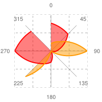
In charts of type This example uses the same parameters as the previous example, but has a line fill specified for both data series. This example includes grid lines.
|
 chg=25.0,25.0,4.0,4.0 |
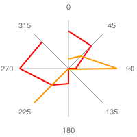
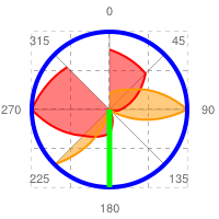
In radar charts, horizontal line markers are bent into circles, and vertical line markers radiate outward from the center, as shown here.
See Shape markers for more information about available shapes. |
 chm= |


Chart Types (cht)
There are two types of radar charts: straight line charts (cht=r)
curved line charts (cht=rs).
| Parameter | Description | Example |
|---|---|---|
r |
For a chart of type |
|
rs |
Chart type rs connects points with curved lines. |
 cht=rs |

Series Colors chco
Optionally specify the colors of the lines using the chco parameter.
Syntax
chco=<color_1>,...,<color_n>
- <color>
- Specify one or more line colors in RRGGBB hexadecimal format separated by commas. If there are more lines than colors, the extra lines will cycle through the color list from the beginning.
Standard Features
The rest of the features on this page are standard chart features.