This page is here to show you what's possible with the Charts API.
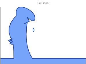 |
Blue Man
A detailed hand-drawn line chart (lxy).
By: Roberto Mensa |
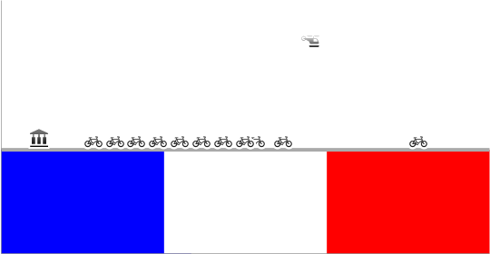 |
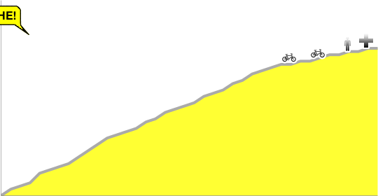
Tour de France, Charted
By: Thomas Guest
1987, Pedro Delgado
Graphic reproduction of Stephen Roche's dramatic mountain stage in the
1987 Tour. Pedro Delgado, wearing yellow, had built a substantial lead
over his rival on the climb up La Plagne. Yet somehow Roche clawed his
way back into contention, appearing at the finish line just 5 seconds down
on Delgado. He surprised everyone. He collapsed, exhausted, and had to
be given oxygen, but he’d done enough; Roche went on to win the Tour. Formidable!
2009, Mark Cavendish
Mercurial manxman Mark Cavendish won an incredible 6 stages of last the 2009
Tour. Here he is, becoming the first Briton ever to win the final showdown
on the Champs-Élysées, and winning it by an immense margin. |
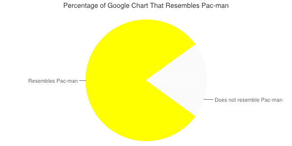 |
Pac-Man
A pie chart that resembles the legendary Pac-Man.
By: Paolo Massa |
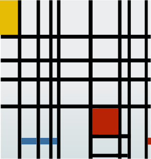 |
Mondrian
Line chart reproduction of the famous painting by Piet Mondrian: "Composition
with Yellow, Blue, and Red" (1937-42) built with linechart.
By: Dmitry Scriptin |
 |
Scatter Chart Star Map
Shows a star chart for a specific location on earth, showing the equator
(x), the ecliptic (o), the pole (N),
zenith (z) and several planets (h—Saturn, d—Mars, D—the
moon).
By: Mike
Duffy |
 |
Fox
Line chart (lxy) trace of a hand-drawn image.
By: James of EPH Phone
Answering Services |

|
Punchcard Chart (Scatterplot)
A nice example of using both size and placement of points in a scatterplot
to convey information. Some things to note in this chart URL:
cht=s - This
is a scatterchart.chd=0,1,2,3,...|0,0,0,0,...|0,1,3,0 - The data in this
chart is very neatly laid out in grid form. This scatterchart uses three
series; the last series is used to specify dot size.chds=-1,24,-1,7,0,17 - The chds parameter sets a scale
of -1—24 columns and -1—7 rows. This allows you to specify
dots using a simple grid corresponding to hours and days, where zero
is the first entry. The scales start with -1 so that dots are not drawn
right on the axis lines (it adds a blank row/column around the chart).chm=o,333333,1,-1,25 - Specifies the default marker type used for all
points. It assigns a nearly black circle 25 points across as the default
size. 25 is the size of the maximum data value; values less than this
in the third data series will cause smaller dots.chxl=0:||12am|1|2|3|4|5|6|7|8|9|10|11|12pm|1|2|3|4|5|6|7|8|9|10|11||1:||Sun|Mon|Tue|Wed|Thr|Fri|Sat| - The labels for the x- and y-axes. The first value
is empty (specified as '||') for both axes, to leave an empty space on
the axis intersection.
By: github.com |
&chxl=0:||25|50|75|100|1:|Hits|2:|Nov|Dec|Jan|Feb|Mar|3:|2007|2007|2008|2008|2008|4:|Month&chxp=1,50.0|4,50.0&chxr=1,0.0,100.0&chxs=0,FFFFFF,12,0|1,FFFFFF,12,0|2,FFFFFF,12,0|3,FFFFFF,12,0|4,FFFFFF,14,0&chxt=y,y,x,x,x&chma=55,120,0,0) |
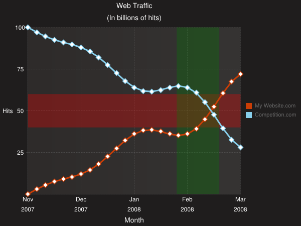
Web traffic line chart (Line chart)
A nicely done line chart demonstrating line styles, overlapping markers,
grid lines, fills, and range markers. Here are the parameters of interest:
cht=lc - A line chart, which spaces points evenly along the x-axis.chg=25,25,3,2 - Specifies the grid size and pattern. Here it's 25-unit
lines along both the x- and y-axes, with a three-pixel dash and a two-pixel
space, giving dashed lines.chf=bg,s,1F1D1D|c,lg,0,363433,1.0,2E2B2A,0.0 - Two fills: one for the
chart background, and a lighter one for the chart plot area.chm=
- The white-filled diamond markers on the line are actually a combination
of two markers: a line-color marker first, then a slightly smaller white
marker of the same size and shape on the same point, giving the appearance
of a white-fill diamond marker. Because the fill color is specified first,
it will be beneath the white marker automatically, so you don't need
to specify the z-order value for the marker to handle layering.
r,FF00004C,0,0.40,0.60 - Horizontal red band across the chart background.
Note how the start and end values are from the range of 0.0-1.0, not
0-100. It also specifies a transparency to allow the grid lines and
background to show through.- R,0080004C,0,0.70,0.90 - Vertical green band across the chart
background. Note how the start and end values are from the range of
0.0-1.0, not 0-100. It also specifies a transparency to allow the grid
lines and background to show through.
- d,CA3D05,0,-1,12,0|d,FFFFFF,0,-1,8,0 - Red diamond markers
on all points on the blue line. The first marker is the red diamond,
the second is slightly smaller and white.
- d,87CEEB,1,-1,12,0|d,FFFFFF,1,-1,8,0 - Blue diamond markers
on all points on the blue line. The first marker is the blue diamond,
the second is slightly smaller and white.
chxt=y,y,x,x,x and chxl=0:||25|50|75|100|1:|Hits|2:|Nov|Dec|Jan|Feb|Mar|3:|2007|2007|2008|2008|2008|4:|Month - Axis labels. This chart shows five sets of axis labels: two y-axes, and
three x-axes. The innermost y-axis (index 0) includes a blank label instead
of a "0" marker, which would crowd the lower left corner of the
chart a bit.chxp=1,50.0|
4,50.0 - Specifies the placement of the "Hits" and "Month" labels on the y- and x-axes,
respectively.chma=55,120,0,0 - The left and right margins are increased to add a little
space between the sides of the chart and the "Hits" label and legend text.
By: charts4j.com |
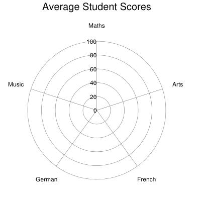 |
Radar Chart
A nicely done radar chart with markers showing some rather poor grades
in different fields of study.
cht=r - A radar chart.chxt=y,x - Show the numeric scale as concentric circles (x-axis), plus
degree markers (y-axis).chls=4 - Line style for the radar trace line (four-pixel-wide line).chd=t:80,49,48,78,59,80 - The data includes one redundant point: the
first and last point have the same value, to enable the plot to wrap
nicely.chxp=0,0,20,40,60,80,100 - Specifies the grid lines to show on the
x-axis. Without this parameter, grid lines would be shown every 10 units,
which would create a very busy chart.chxl=1:|Maths|Arts|French|German|Music - Only five labels specified
for six data points. The chart is sliced into whichever is greater: labels
or (data points - 1). In this chart, they are the same value.chm=s,CC3366,0,-1,12,0|s,FFFFFF,0,-1,8,0 - Creates a filled-square
style marker, created by first specifying red squares, then a slightly
smaller white square. The white square is specified second, so it is
drawn second, and there is no need to worry about specifying z-order
of each marker to determine how they are stacked.
By: charts4j.com |
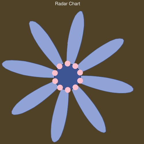 |
Fanciful Radar Chart
A fanciful radar chart. It consists of two
data series: one for the petals, and one for the blue eye in the middle.
The small pink circles are circle markers. The eye and the petals are colored
using line fills. Some things to note in the URL:
cht=rs - A radar chart of type rs rather
than r to
give rounded splines.chd=s: ... - Two data series specified, each with 202
data points. The first series is for the petals, the second is for the
eye in the middle. Each point is about 360/202 = 1.8 degrees apart.chf=bg,s,504227 - Brown background fillchm=
B,8FA3D6,0,0,0 - The periwinkle fill for the petals.o,FFC0CB,1,0,20,0 - Ten pink circle markers (not all shown here)
20 data points apart (about 36 degrees apart).o,FFC0CB,1,20,20,0o,FFC0CB,1,40,20,0- ...
o,FFC0CB,1,200,20,0B,3D5593,1,0,0 - The dark blue fill for the central eye
By: charts4j.com |
 |
Lissajous Curve (Line chart)
Most people have seen a Lissajous curve on an oscilloscope.
This is an lxy line chart that uses
a brute-force approach to plot every point in the curve, dot by dot. It describes
the x- and y-coordinates of 800 individual points using extended
encoding format.
By: charts4j.com |
|2nd%20Game%20of%20Back-to-Back%20Set|3rd%20Game%20in%204%20Days%20(Rested%20Yesterday)|1%20Day%20Rested|2%20Days%20Rested|Rested%20at%20Least%203%20Days&chm=N,000000,0,-1,10|N,000000,1,-1,10|N,000000,2,-1,10|N,000000,3,-1,10|N,000000,4,-1,10|N,000000,5,-1,10|N,000000,6,-1,10&chtt=The+Impact+Of+Rest+Days+On+Team+Efficiency+And+Pace)
Vertical Bar Chart
The chart figures out the impact of rest days
on the possession based stats in the NBA. It shows how NBA league average
differs when the teams play with the given rest days. By: NBAStuffer.com |


&chxl=0:||25|50|75|100|1:|Hits|2:|Nov|Dec|Jan|Feb|Mar|3:|2007|2007|2008|2008|2008|4:|Month&chxp=1,50.0|4,50.0&chxr=1,0.0,100.0&chxs=0,FFFFFF,12,0|1,FFFFFF,12,0|2,FFFFFF,12,0|3,FFFFFF,12,0|4,FFFFFF,14,0&chxt=y,y,x,x,x&chma=55,120,0,0)


|2nd%20Game%20of%20Back-to-Back%20Set|3rd%20Game%20in%204%20Days%20(Rested%20Yesterday)|1%20Day%20Rested|2%20Days%20Rested|Rested%20at%20Least%203%20Days&chm=N,000000,0,-1,10|N,000000,1,-1,10|N,000000,2,-1,10|N,000000,3,-1,10|N,000000,4,-1,10|N,000000,5,-1,10|N,000000,6,-1,10&chtt=The+Impact+Of+Rest+Days+On+Team+Efficiency+And+Pace)
