
This document describes how to create scatter charts using the Chart API.
Table of Contents
Chart-Specific Features
|
Standard Features
|
Introduction
A scatter chart (or scatter plot) is a set of individual dots on a two-dimensional chart. You can optionally specify the size of the individual dots. A scatter plot can accept only one data series. Scatter charts are good for detecting groupings or patterns in many data points that have two variables (if you have only one variable, consider a line chart).
You must supply at least two data series: the first data series specifies x-coordinates, and the second data series specifies y-coordinates.
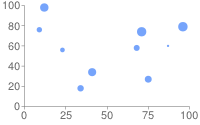
You can optionally supply a third series to specify individual point sizes. Without this series, all points will default to 10 pixels across.
Note that if you use chm to alter the shape or color of data points,
points are scaled relative to the size provided in chm.
Chart Types (cht)
Specify a scatter chart with this syntax:
Syntax
cht=s
chd=<x_values>|<y_values>[|<optional_point_sizes>]
| Description | Example |
|---|---|
The default marker for data points is a blue circle. To use
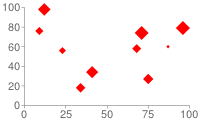
a different color or shape, specify the shape markers by using the This chart varies the point size by including a third data series. |
|
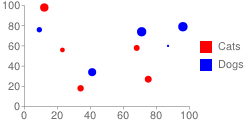
If you
want to simulate multiple series through the use of colors, use the This chart has three data series: the first is the x-values, the second is the corresponding y-values, and the third is the corresponding point size. The The legend is assigned using the |
 chd=t: |
To vary the shape of the points, use shape
markers. Shape markers behave slightly differently in scatter charts
than in other charts, depending on their order in the
More tips on using shape markers:
|
 chm=d,FF0000,0,-1,15Set the default shape to diamond (d) 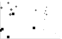 chm=Default is diamond ( d), marker index 15 and later are squares (s)
overlaid on the diamonds.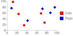 chd=t: |
You can also add a line marker (
|
 chd=t:
|
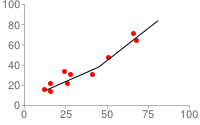
Here is how to create a trace line through your points without relying on visible points:
Scatter charts can't be used as compound charts, so you can't add an extra series to describe your line. You cannot specify a dashed line using this method, but you can specify line color and thickness. |
Trace line with hidden points:chd=t: |
Series Colors chco
Specify the color of the dots using the chco parameter. You can specify
a single color for all points, a gradient, or colors for individual points.
Syntax
chco=<single_color>
  or
chco=<point_1_color>|...|<point_n_color>
  or
chco=<gradient_start>,...,<gradient_end> (only with third data series)
- <color>
- Color of the points, in RRGGBB
hexadecimal format.
There are a few different formats:
- Specify a single color to apply to all points.
- To apply individual colors to individual points, specify one color per dot, with a pipe delimiter.
- If you specify individual dot colors but have fewer colors than dots, every nth point is given the corresponding nth color. This is the way to create a multiple series scatterchart.
- To apply a color gradient, you must include a third data series (which determines point sizes). Include two or more colors separated by commas to apply a color gradient to points depending on the size of the dot.
Standard Features
The rest of the features on this page are standard chart features.